
[PT]
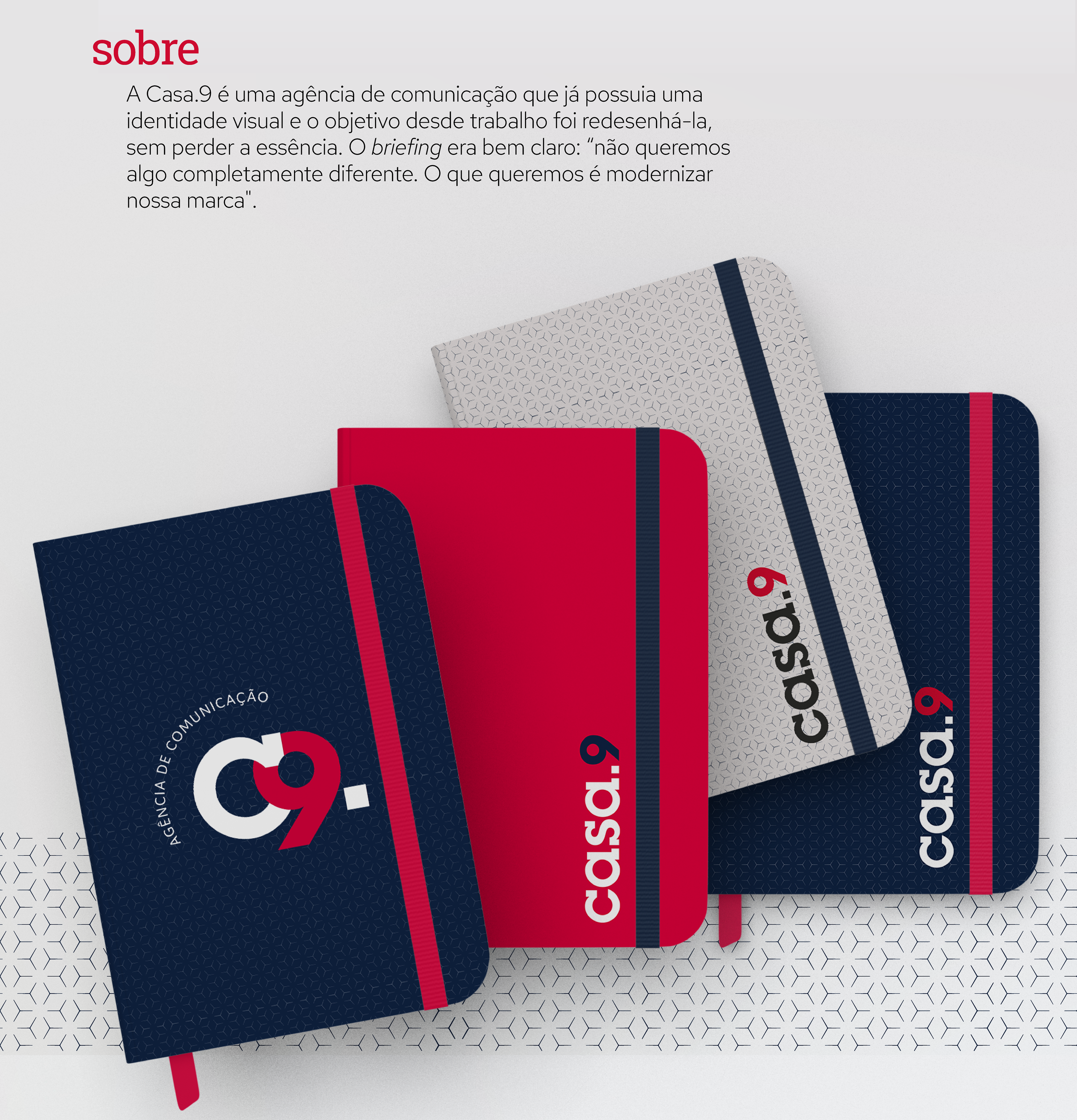
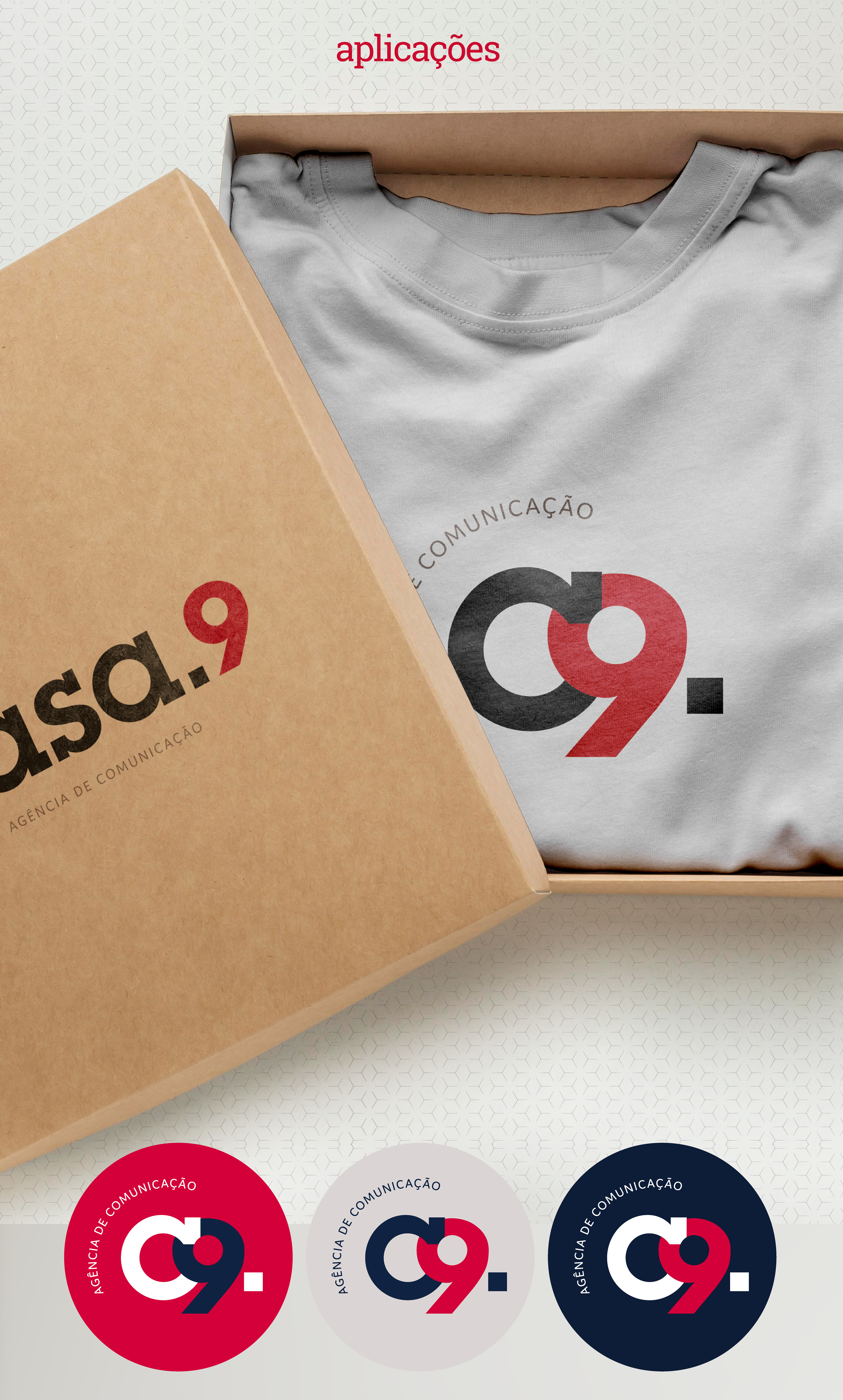
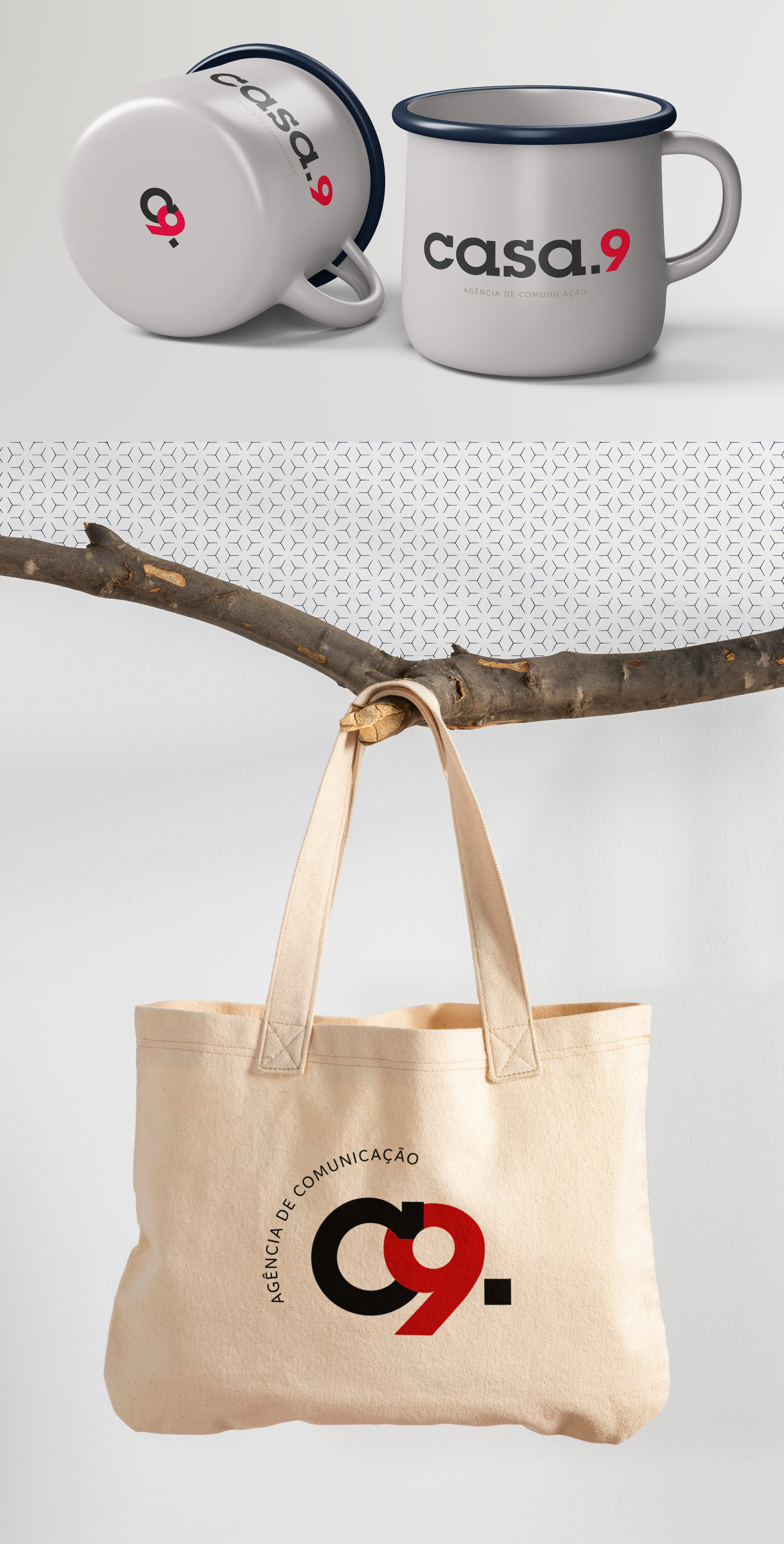
A Casa.9 é uma agência de comunicação que já possuia uma identidade visual e o objetivo desde trabalho foi redesenhá-la, sem perder a essência. O briefing era bem claro: “não queremos algo completamente diferente. O que queremos é modernizar nossa marca".
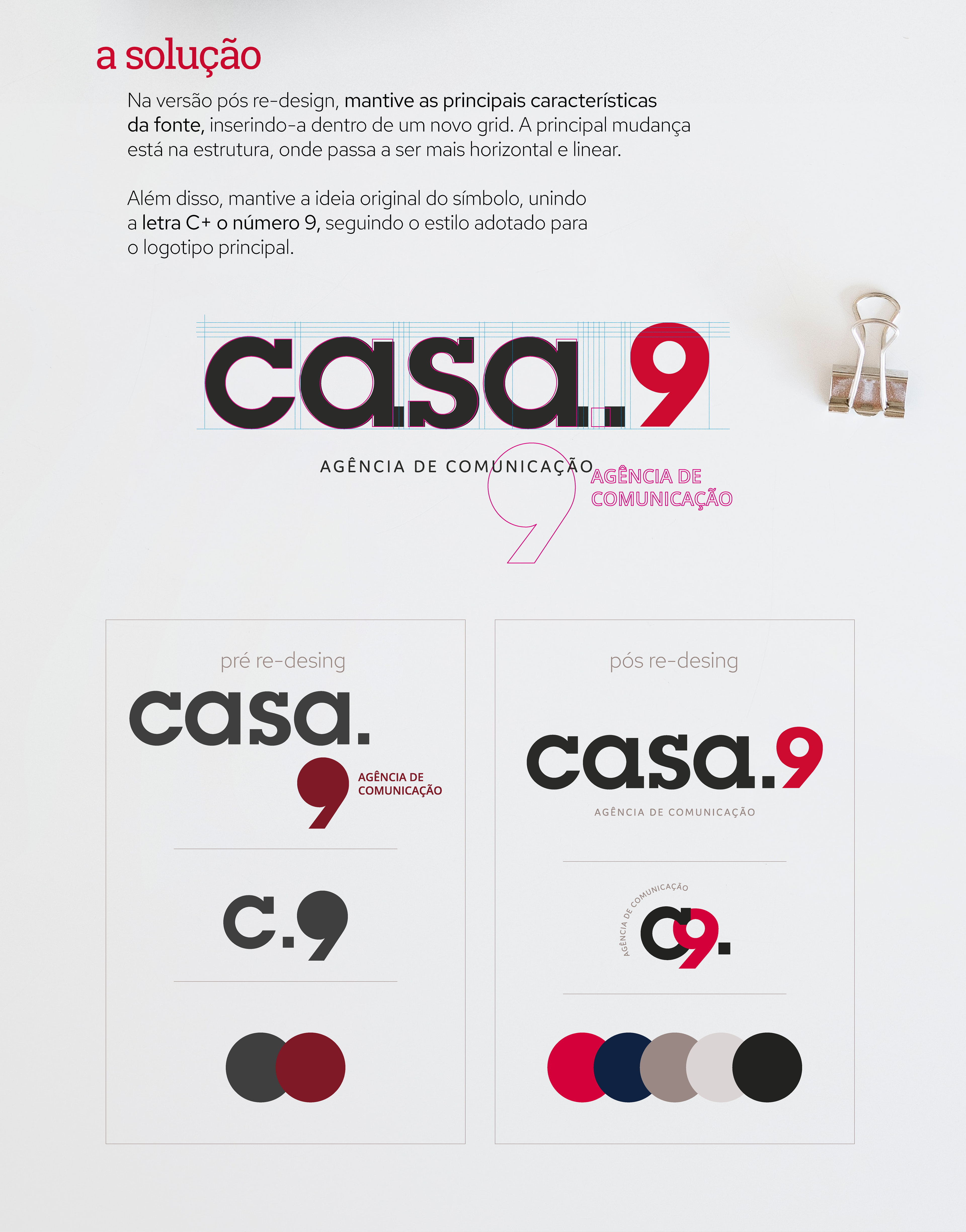
Na versão pós re-design, mantive as principais características da fonte, inserindo-a dentro de um novo grid. A principal mudança está na estrutura, onde passa a ser mais horizontal e linear. Além disso, mantive a ideia original do símbolo, unindo a letra C+ o número 9, seguindo o estilo adotado para o logotipo principal.
[EN - TRADUZIDO AUTOMATICAMENTE]
Casa.9 is a communication agency that already had a visual identity and the objective of this work was to redesign it, without losing its essence. The briefing was very clear: “we don't want something completely different. What we want is to modernize our brand".
In the post re-design version, I kept the main characteristics of the font, inserting it into a new grid. The main change is in the structure, where it becomes more horizontal and linear. In addition, I kept the original idea of the symbol, joining the letter C+ and the number 9, following the style adopted for the main logo.